Hello,
Sorry for yet another post but these are just little feedback points I picked up over the last few sessions that might be of interest to you ![]() .
.
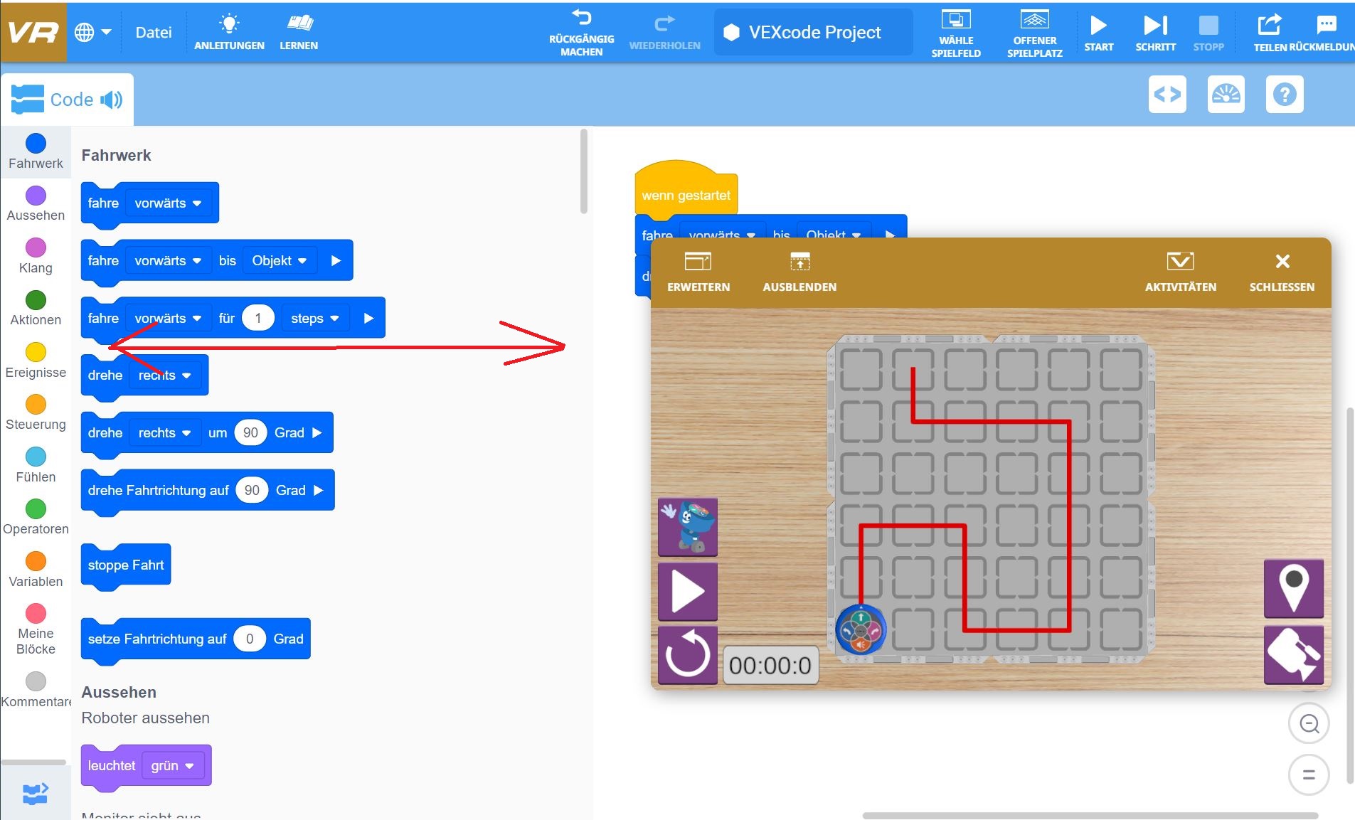
We have ThinkPad laptops which have a pretty standard screen ratio. Sometimes the kids struggle with screen space to fit the blocks, code and the playground into the screen. I know that the blocks section can be collapsed as well as the playgrounds etc. but it really helps them to see everything at the same time! As a matter of fact this would mostly be possible were it not for the fact that the blocks section on the left hand side can’t be adjusted in width. It seems to have a fixed width which far exceeds what is actuall necessary i.e. there is a lot of white space (certainly for the blocks that we use at the moment). See image below for an example. If the blocks section could be adjusted in width then placing all the important parts into one view would be much easier.
Thanks,
Michael